Let's face it, shopping for camping gear can be a pain. It's tricky, time-consuming, and easy to forget the essentials. Plus, those high prices and the whole "what if it's not good quality" worry don't help either. My mission: solve these issues and make camping gear shopping fun and easy.
What problem are we trying to solve?
As part of my Google UX Design Certification, I worked on a hypothetical e-commerce app focused on camping gear. The goal? To make the shopping journey smooth and stress-free, tackling common headaches found in existing camping stores and apps. This case study walks you through my process and the final design for an interactive experience that makes buying camping sets a breeze.
User Research
Primary Research
I sent out a questionnaire to 5 camping enthusiasts. Here's what I found:
- Everyone was annoyed by the high prices (5/5 of respondents).
- Most preferred buying complete camping sets instead of individual items (4/5).
- All of them liked in-store shopping better because they could see and feel the quality (5/5).
Secondary Research
I checked out different camping store sites and apps, and guess what? Many had confusing navigation and made finding products a real chore.
Ideation
I brainstormed a bunch of ideas and finally landed on something cool: an interactive experience for putting together camping sets. Here's the breakdown:
- Explore Ready Sets: Pick from pre-selected sets based on your needs.
- Build Your Own Set: Choose individual items for each category like accessories, sleeping gear, etc.
Since "Build Your Own Set" is pretty standard in e-commerce, I put the spotlight on the more exciting "Explore Ready Sets" journey.
Design process
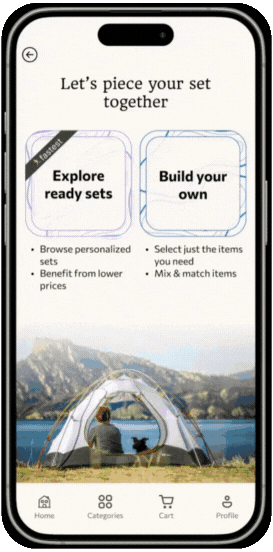
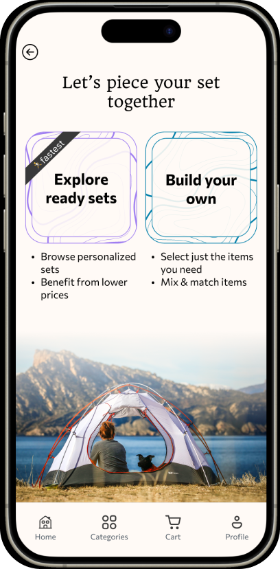
Option Selection Screen
Users get to choose between "Explore Ready Sets" and "Build Your Own Set." Each option is styled as a card with a cool topographic map outline to set that outdoorsy vibe. Beneath each card, the benefits are spelled out to tackle user pain points:
- "Benefit from lower prices" under "Explore Ready Sets."
- "Fastest" label showing it's the quickest way to get geared up.
As we know, even the best prompt can't make a person act if they are not able to. How expensive something is and how long it takes are crucial factors that affect a person's ability to proceed, making these steps vital in reducing friction and enhancing user engagement.
Finally, a background image of a person camping adds a nice touch to set the mood.
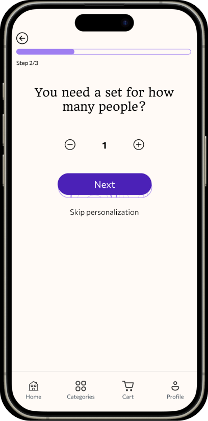
Personalization steps
To make sure users get the right set, they answer three quick questions:
- What type of camping set do you need?
- How many people is the set for?
- What's your budget?
Each question is on a separate screen to keep things simple. A progress bar shows users they're almost done, and they can go back anytime. The "Next" button, featuring the topographic map outline, leads them through. There's also a "Skip personalization" option, but it's worded this way to showcase the value of the process.
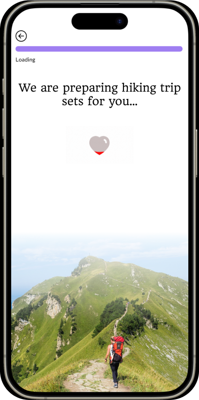
Loading screen
After answering the questions, a brief loading screen pops up (even though it is artificially added), reinforcing that their sets are being personalized just for them.
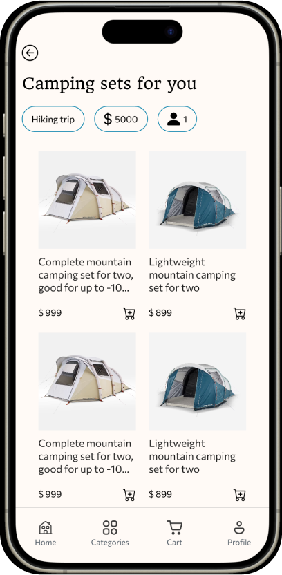
Personalized sets screen
This screen shows off the personalized sets along with the filters based on the user's answers. It's a nice way to reassure users that the sets are tailored to them, and they can tweak their preferences easily if needed.
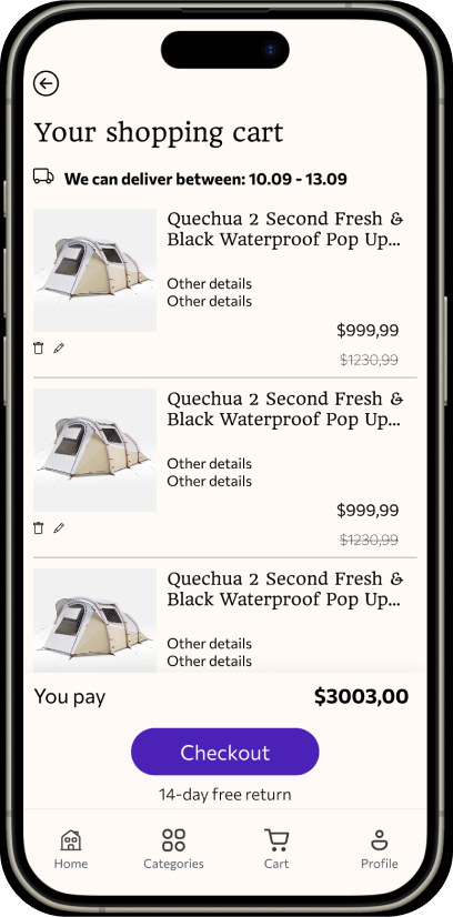
Cart screen
The cart screen has some cool UX touches:
- "We can deliver between" text to set clear delivery expectations.
- "14-day free return" message right under the call-to-action, easing worries about quality and returns.
- Discounts are also highlighted to remind users of the savings.
Outcome
The final design hits all the right notes:
- Makes selecting a camping set quick and easy.
- Offers budget-friendly options to tackle price concerns.
- Boosts confidence in online shopping with clear return policies and delivery info.