To be able to plan the information architecture of any page, we should first answer some questions about it. It's not enough to know a page is a parent/category.
In terms of really basic SEO, a category page should serve the purpose of a navigational hub towards other pages. It should have links to its children, which help search engines (and users, too!) to understand the topical clusters on our site.
But there's more to it. Let's look at the following questions:
Content
- What information do we provide?
- How is it relevant to the user?
Context
- Where is the user looking for this information?
- When, why and how is the user engaging with it?
User
- Who are our users?
- What value does our content provide to them?
- What expectations do they have of the content?
By now, you've already guessed correctly that this context is what would determine the information architecture on our category pages. So let's explore some scenarios by sketching them out.
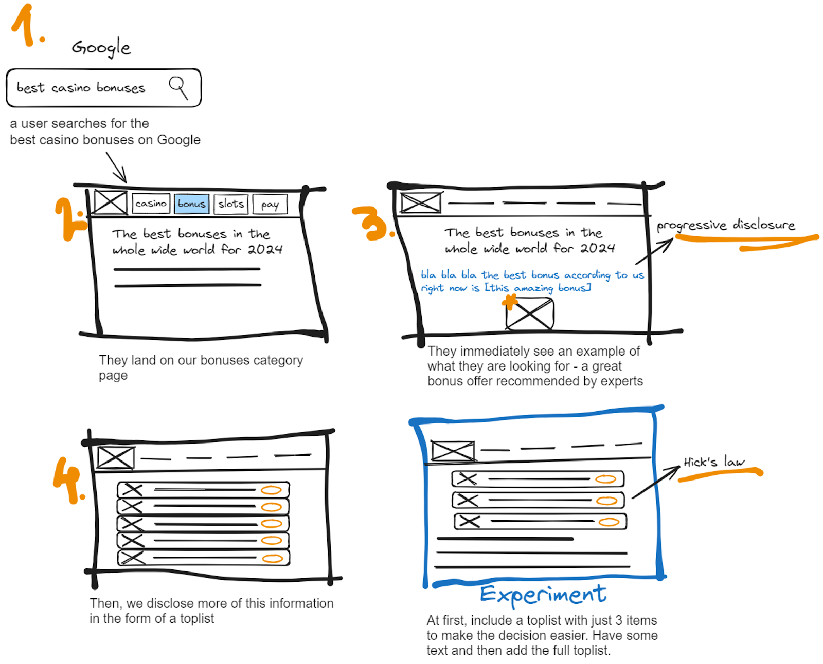
Scenario 1: The user is coming from Google
Let's take our bonuses category page as an example.
We are providing a ranking of the best bonuses, as well as general information about casino bonuses. This page is providing a direct answer to a user query. The user is looking for this information on Google. They engage with our page when they are looking for bonuses to compare and claim. We don't know too much about our users, as we haven't conducted a user research. We do know though, based on the most searched for queries, that they expect that the information we present will make their decision making process easier by eliminating a lot of the research phase.
🔑 Key takeaways from scenario 1:
- Our current setup is the right foundation for this scenario.
- We disclose information gradually by providing them with one example of a good bonus in our intro text.
- We continue by showing more of the same information in the form of a toplist before proceeding with the rest of the content.
🧪 Content experiment:
Try having a list of just 3 operators at the beginning of the page. Have some text and only then present the full toplist. We will measure if this makes it easier for users to convert as they will have less options to compare and choose from.
❓ Questions arising from scenario 1:
- Is the CTA in the top operator card too aggressive and make the user feel as if we are forcing them to convert? Should we explore the option to replace it with a more gentle link towards the review page instead?
- Shouldn't we revise the toplists on category pages to ensure they meet the needs of different users? For example, the bonuses toplist consists only of welcome bonuses, meaning we are excluding existing users. Filters?
- Shouldn't we provide some personalization in the form of filters or links to sub-pages? We want to help users find what they are looking for.
Scenario 2: The user is coming from the main navigation
In scenario 2, we are providing the same content, but the user is not coming from Google. Instead they have found this page by exploring our main navigation.
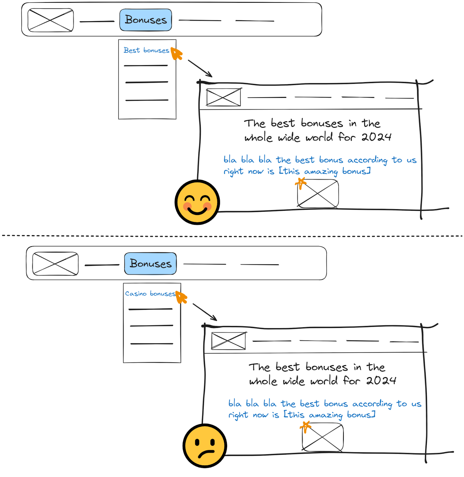
✏️ Labeling is important because it sets the right expectations. If the label is "Best casino bonuses", then our page's content perfectly fits this criteria. If it's "Casino bonuses", some users might expect something more of a hub that would help them navigate to a proper category of bonuses.
🔑 Key takeaways from scenario 2:
- Labeling is crucial for setting the right expectations.
- With the proper label, scenario 2 overlaps with scenario 1 when it comes to conclusions.
- We need a third scenario to explore the possibility of users having trouble navigating to the child pages of a category.
❓ Questions arising from scenario 2:
- There is always a chance a less descriptive anchor is used somewhere. We can certainly find examples of just "casino bonuses" being used as an anchor text on CTO. How can we satisfy these users?
- Some might get confused anyway, as this page serves double intents - one is to serve rankings, another to be a category page. Some might understand that by "Best bonuses", we mean best types of bonuses. How do we satisfy these users?
Scenario 3: The user wants to navigate to the pages within the category
In scenario 3, we have the user coming in from either a breadcrumb path or another page containing a link to that one with a non-descriptive anchor. It also might be that the user has expectations that are more of an edge-case scenario: they presume that "Best bonuses" would showcase the best types of bonuses.
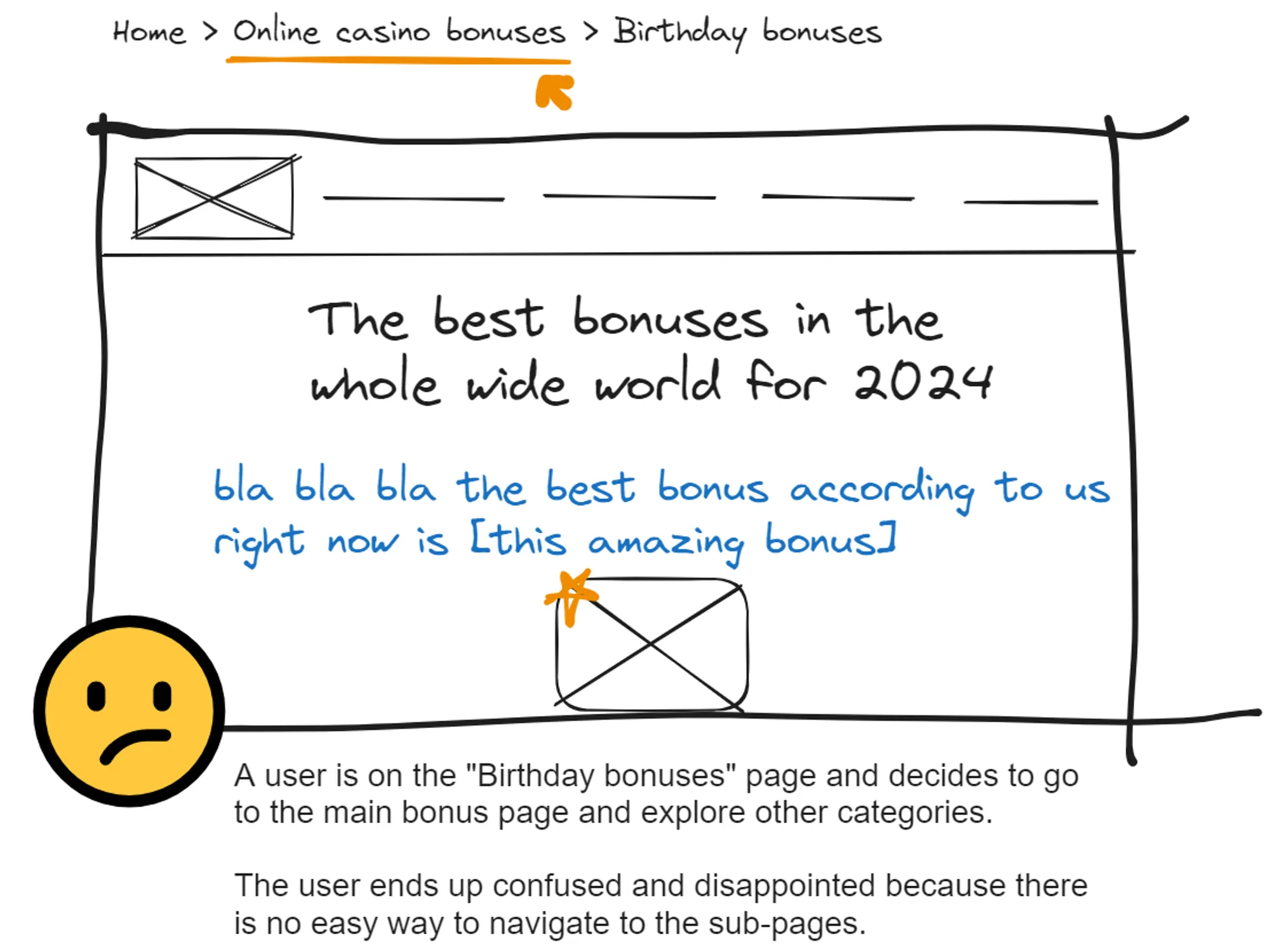
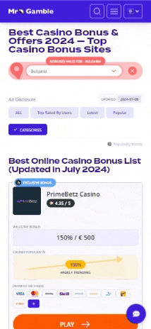
While there might be other solutions to this issue, it is worth exploring the example from Mr. Gamble, which we mentioned earlier. Positioning a categories dropdown at the top of the page could help users quickly find what they're looking for.